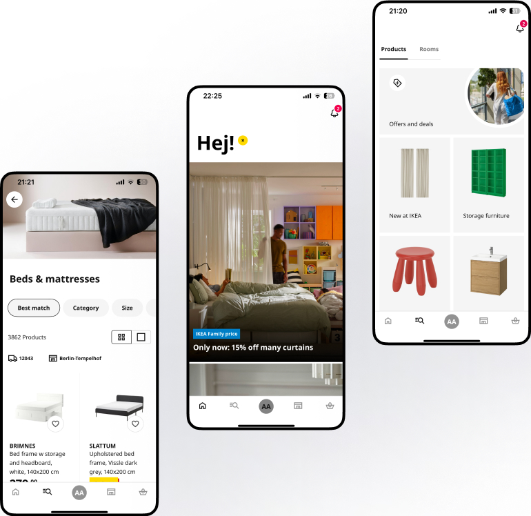
IKEA Revamp

What are we redesigning?

The focus is on a modern revamp of the IKEA mobile app to simplify navigation, inspire purchases, and streamline the shopping experience.

Goal

The goal is to enhance the overall user experience of the IKEA mobile application by simplifying user flows and streamlining the user journey. The aim is to reduce friction, improve clarity, and ensure that users can navigate, explore, and complete tasks with ease and confidence throughout the app.

Challenges

Inspiration

One key challenge is maintaining IKEA’s strong brand identity, its playful yet practical tone, clean design language, and global familiarity while introducing a more modern and intuitive user experience.

Efficiency

Current user flows are complex and fragmented, making it difficult for users to complete tasks smoothly. Challenge lies in simplifying these flows to create a more seamless, purposeful journey that improves efficiency and purchase.

Pain points

Existing app has a cluttered interface and inconsistent interactions. Core challenge is to redesign experience into a more cohesive and user-friendly system that addresses the usability issues and elevates overall experience.

So “How Might We?” visually and functionally improve 
IKEA's app?

Easy Navigation

Design a straightforward and intuitive layout that allows users to move through the app effortlessly, reducing cognitive load and unnecessary steps.

Clear Categorisation

Structure product categories with lucid filters based on how users naturally browse and shop, ensuring logical grouping and quick access to relevant items.

Consolidation

Present essential product information like images, specs, categories, availability, and actions on a single, scrollable page to minimize back-and-forth navigation.

Information Architecture